BLOG
FAKE CROW'S BLOG
Rapid User Testing with Mechanical Turk

How We Supercharged Our User Testing Using Mechanical Turk, Google Forms and Usability Hub.
When working with startups we are often treading new ground on new products and it is important to begin validating assumptions early and often. It also helps to have some data to back up our design decisions when presenting them to stakeholders. We’ve been experimenting with different methods for getting rapid user feedback and we’d like to share some of our explorations.
We started out by researching the existing solutions on the market. There are a number of online tools available for remote user testing, and in fact there are enough choices that it can be a little hard to decide between them. So to narrow it down we had to decide what was most important:
Our top 3 must-haves
#1 – It needs to be fast.
In a perfect world, we’d be able to launch a test and get actionable results within the hour, but since that product is in design phase and doesn’t exist yet, we’ll settle for a turnaround of less than 8 hours. That means we can run a test first thing in the morning and have results by the end of the day, or vice versa for an overnight test.
#2 – It needs to be cheap.
We don’t want to spend $10 or more per user like some of these services charge, or even $50 – 100 or more per month. We want a service that we only pay for when we use it, and is cost effective at scale.
#3 – The results need to be of good quality.
Which means the respondents need to be of good quality. We want the option to invite our own respondents, or to crowdsource from an experienced testing pool.
No one tool really meets all of these requirements, however there are a few that come fairly close. With a few minor hacks, we’ve managed to come up with a pretty good solution for our needs.
Let’s break it down…
There are really three distinct steps to this process, so let’s tackle them one by one. We’ll start by designing the test, followed by distributing the test, and we’ll finish with organizing the data.
STEP 1 – DESIGNING THE TEST
The first thing we had to do was to figure out what we wanted to test and how we wanted to test it. In our case, we wanted to reach out to people for feedback on early stage UI designs to help inject more data-driven decision making into our design process. If we find ourselves at a crossroads between two different approaches to a UX/UI problem, instead of spending time qualifying our gut feelings we’d rather just run a quick and dirty test, and let the data inform the decision. In its simplest form this would take shape as an A/B split test, in which we compare one design against another and ask test respondents to select their favorite.
We start with the designs we want to compare. This might be as simple as two single images, such as two different versions of a banner ad, or it might be more complicated like two sets of screens from an app featuring different UI patterns. Whatever the case, we combine the comps into a single image, placed side-by-side on a neutral grey background, indicating which is “A” and which is “B” . For sets of multiple comps, we split set “A” and set “B” into two separate images, and assign numeric labels to individual screens within each set. This way, testers can easily refer to and compare specific screens by their letter and number values, such as “screen A-1” or “screen B-3”.
Outline main goals, heuristics, and evaluation criteria.
Before we dive into writing any test questions, it’s important to get our priorities straight. What is it we want to learn from this test, and how do we structure the test so that the results help us to learn it? If we assume that the people taking this test have never done this sort of thing before, then we need to teach them how to respond in a manner that is both honest and useful, and we need to make it as easy as possible for them to do so. Just like we would if we were critiquing someone else’s work, the idea is to establish the three or four main heuristics that we hope to evaluate, and create a description for each one. Then, by providing those descriptions in our test instructions, we hope to create an appropriate mental framework for our testers so they can give the kind of feedback that is most valuable to us. This will create structure for respondents and result in better consistency among their responses.
Since the average person probably doesn’t know what the word heuristics means, we soften the language and call this “evaluation criteria,” “things to look for,” or something similar. These might include visual elements like colors and composition, the choice of language, the utility of certain features, or anything else that you aren’t sure about. By telling them exactly what to look for, you lighten the cognitive load and make the test much more accessible. You also steer people away from impulsive, subjective responses to your designs that aren’t very helpful.
Write your question as a single, simple request.
There are two keys we’ve found to writing a successful test question: keep it simple and leave it open-ended. We recommend you resist the temptation to write a long list of questions or to be too specific about the types of responses you want. It may seem counter-intuitive, but if your questions are too specific you will end up with poorer quality responses. We think this is because people get overwhelmed easily, and the less comfortable they are, the less time they’ll want to spend with our test. Feedback from our early tests showed that long multi-question tests resemble college exams and turn people off at first glance, and overly granular questions tend to limit the variety and intuitiveness of their responses. What we learned is that if we have effectively described the heuristics and established the correct mindframe, then we’re better off getting out of the way and letting people tell us what they think.
A great technique here is to use the phrase, “Imagine you are…” to get people into a role-playing state of mind. For example, “Imagine you are a customer of x brand using their new app for the first time. Which of these two different versions do you feel is easiest to use and why?” This gives people the freedom to answer the question in their own way, and we’ve found that they in turn give more honest, open answers that are more expressive and detailed.
After working out the heuristic framework and the questions to ask, we add one or two introductory sentences to establish the context for the test, and we end the instructions with a sincere thank you note. The full test follows this outline: Intro, question, criteria, image, thank you. We try to edit it down to the bare essentials, so the whole thing can be read through in under a minute.
As far as the presentation goes, it really depends on how you choose to put the test out there, which brings us to the second step in the process: distribution.
STEP 2 – DISTRIBUTING THE TEST
We’ve played with several different methods of distributing tests, including using a few different all-in-one testing services. For our part, we found these to be a bit limiting in terms of customization, so we’ve decided to go a different route. We’ve been using Mechanical Turk as our distribution vehicle, and the results so far have been fairly promising.
MTURK
For those of you who aren’t familiar, Mechanical Turk, or MTurk as it is called, is part of Amazon Web Services. It is an internet marketplace for crowdsourcing human intelligence tasks that computers do not perform well, and provides a scalable, on-demand workforce at low cost – what Amazon refers to as “artificial artificial intelligence.” It was originally created as an internal tool and was launched publicly in 2005, although it is still in beta. The way it works is that “Requesters” enter Human Intelligence Tasks (HITs) into the system, and “Providers” perform those tasks as they see fit for a small reward, usually between $0.01 and $10 a piece. Tasks range from transcribing videos and podcasts, ranking or rewriting content, tagging images, completing surveys, or even spammy stuff like friending people on Facebook – pretty much anything you can think of that can be accomplished on a computer.
You can create a test (called a HIT) through MTurks interface by using the provided templates or customizing with the text/html editor. For enhanced UX/UI you can also try CrowdFlower, which offers a clean interface and some nice templates and other features to make Requesters’ lives easier. CrowdFlower is available for free to qualified academics, non-profits and early stage startups. Actually, there are quite a few online services in this category, a comprehensive list of which can be found here – http://qr.ae/ynV7Z. For the types of tests we’ve been running, MTurk works just fine, but be sure to look at all the options and decide which best fits your situation.
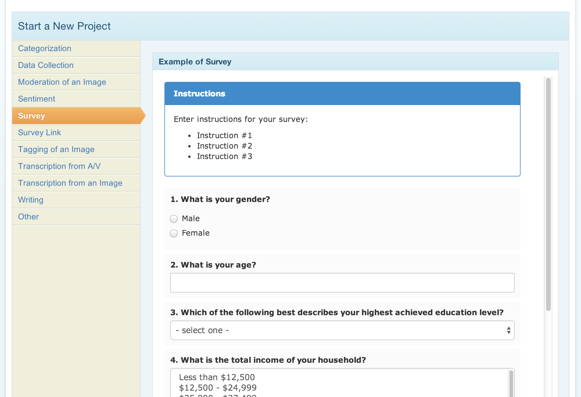
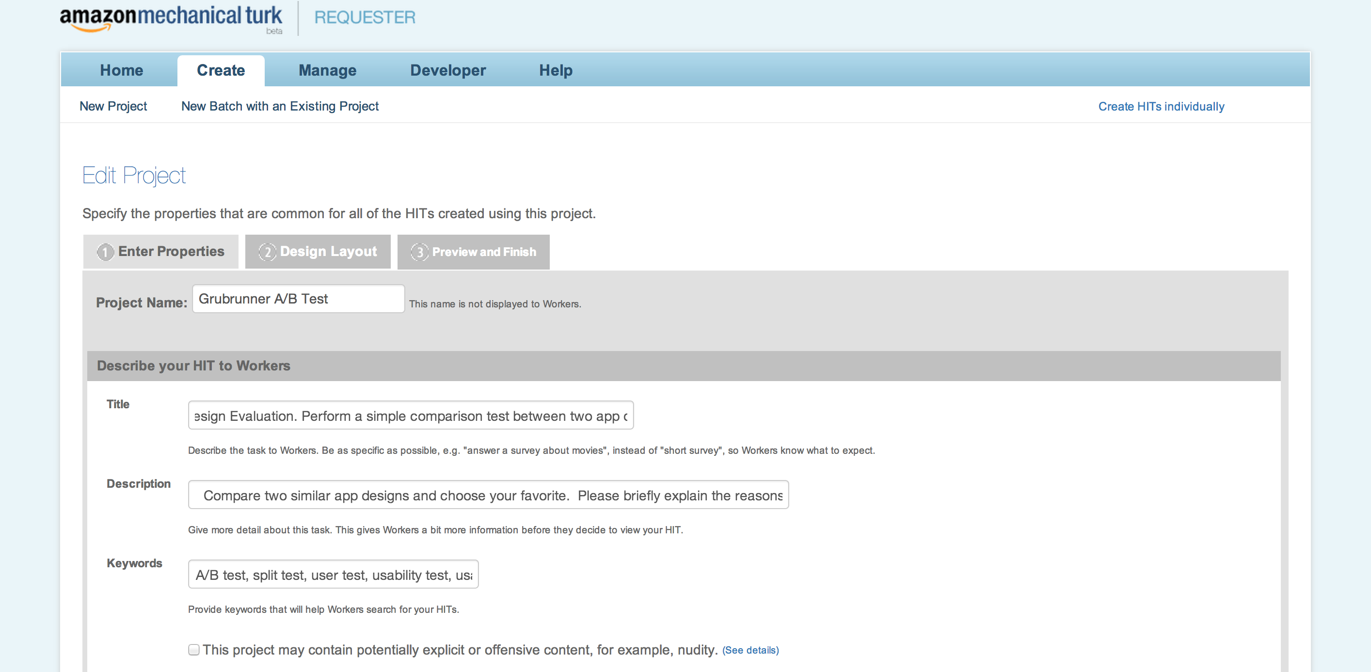
There are a few different ways to get a test into MTurk. The most direct method is through the built-in survey builder, which has a number of question types you can modify, from multiple choice check boxes and radio buttons, to paragraph entry fields for open questions. You can use the visual editor or html editor to customize your questions, embed images, or whatever else you’d like to include. You can create individual HITs, or you can build your HIT as a new project, which you can save and use as a template for running multiple tests, called batches. This is very convenient if you want to A/B test different elements of your HIT to try and improve the responses you get.
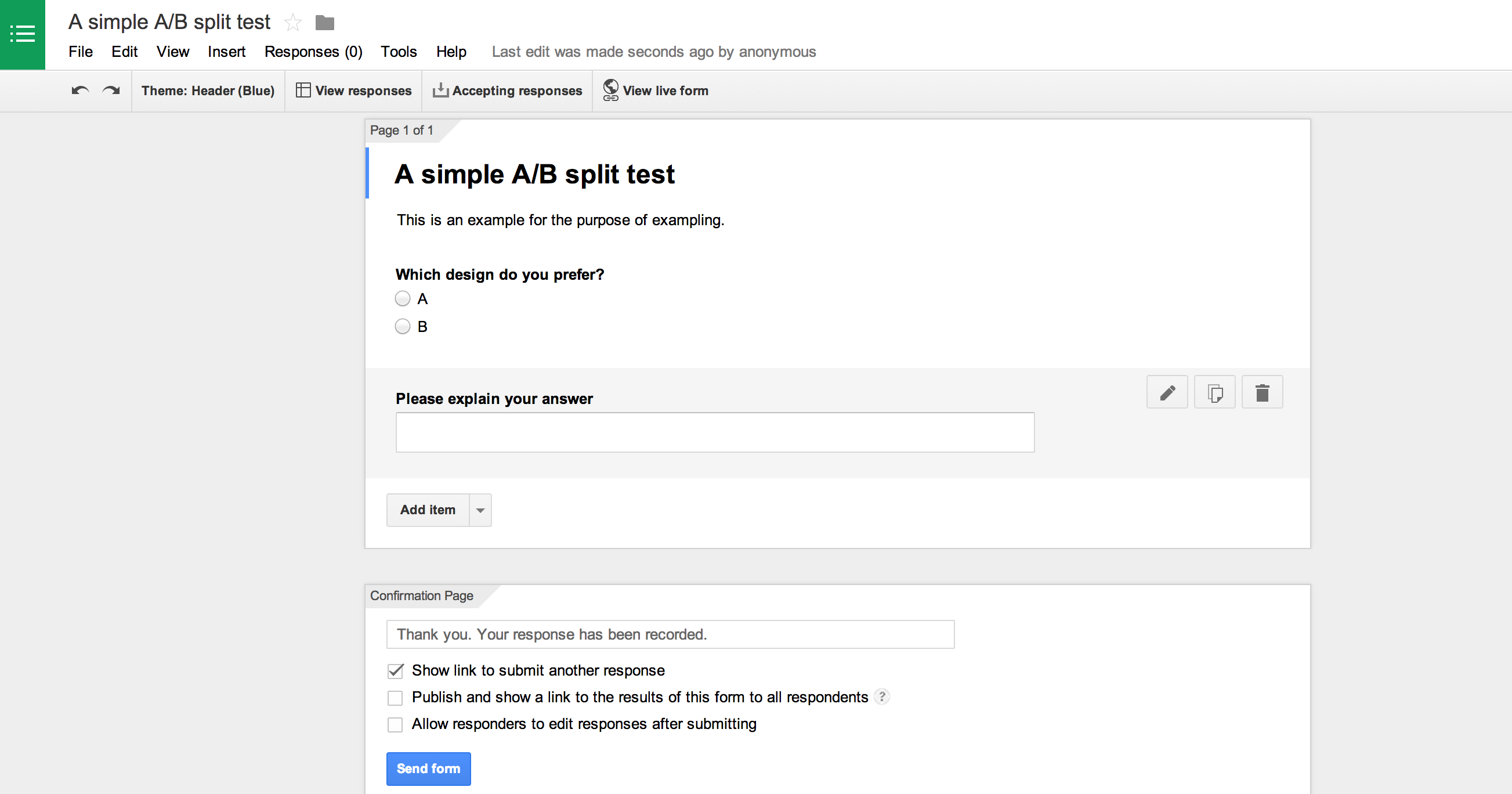
If you struggle with the no-frills interface, another option we’ve used is to build a survey by creating a Google form in Google Drive, and then embedding the html into the html editor in MTurk. This will enable you to create more advanced form elements and give you more control of their appearance, from visual themes to custom validation messages. The best part about this method is that you can also share the form with a link, so you can distribute this survey to your own list in addition to the MTurk network.
You don’t have to invent the wheel.
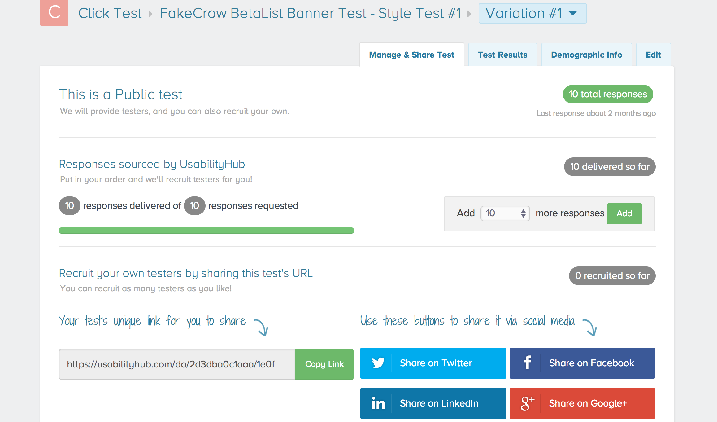
Another option is to create a test using a testing service, and then distribute a link to the hosted test through MTurk. A testing site we really like is UsabilityHub. The UI here is beautifully crafted, and the experience is very intuitive. They have a number of test types you can run, and setup is a breeze. A great feature is the karma system they’ve enacted which gamifies the experience by allowing you to earn testing credits by taking other people’s tests. You earn a point for every test you take yourself, and each point is good for one user response to your own test. It makes it easy to experience the product for free while growing the testing community, and the tests are fun and kind of addicting.
We were able to earn 20 credits in under 10 minutes, and then quickly set up a simple A/B click test to compare two different banner ads we we’re preparing to run in an upcoming promotion. We requested 10 respondents, and let UserHub source them for us as a public test, although you do have the option to run private tests and/or invite respondents directly by forwarding a link. They make it super easy to promote your tests by including social sharing buttons for Facebook, Twitter, LinkedIn, and Google+ as well.
After launching our first test, we received 3 responses almost immediately and were amazed by how quickly they came in. However, the remaining responses trickled in slowly and it wasn’t until the following morning that we had reached number ten. This is the downfall of using a free account, because UsabilityHub uses a priority system that pushes tests from its highest tier paid accounts out to users first. With five tiers in total including the free version, unpaid accounts end up at the back of a long line, so there’s no real way to estimate how long a given test might take to complete.
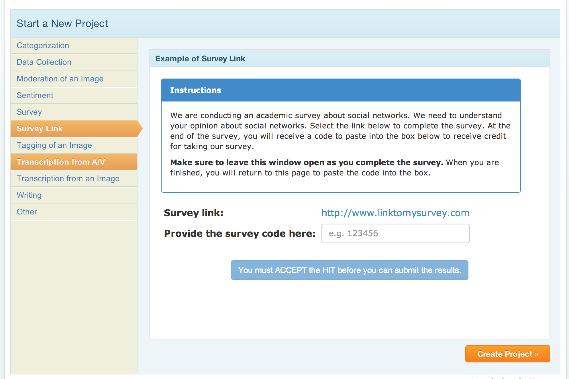
There are three ways to work around this issue. The first and most obvious solution is to upgrade to a paid account, which will bump you up to a higher tier and should result in faster test responses. The second solution is to leverage your social networks to build your own list of test users to whom you can send your tests directly. This is especially great if you want to test within a specific niche group or demographic, since using your own list gives you control over who your respondents are. However, you may not have a large enough network, or you may not be getting a high enough response rate from your list, which brings us back to, you guessed it – Mechanical Turk. One of the project templates in MTurk is called Survey Link, and this works perfectly in combination with a product like UsabilityHub. Providers are given the link generated by UsabilityHub and directed to your test, which is a great way to supercharge your response rate. MTurk can be used as a powerful accelerator to drive respondents to your test.
With great rewards come great response times.
This tip might sound obvious, but the more you pay for your HITs, the more workers you’ll attract. It is definitely worth your time to experiment with the amount of rewards you offer on each HIT until you find the sweet spot. What we’ll do is start at $0.20 and work our way up until the responses start rolling in. We’ve found that we can get reasonable rates tests that take under a minute to complete, like an A/B test between two designs with only one simple question. For more complex surveys taking 3-5 minutes to complete, we would go with higher rates.
It’s important to note that even though the rates may be very low on MTurk, there are still people working on them. Do take into consideration where your participants are located. Assign fair rates for the time and qualifications your testers will put into to complete your tasks. Whether they are US based or off-shore, crowd sourcing platforms are there to create opportunities for the participants.
HERE IS ONE OF THE TESTS WE RAN for one of our startups. The team was undecided between two different design concepts, so we decided to let some objective point of view in, and let the data do the talking.
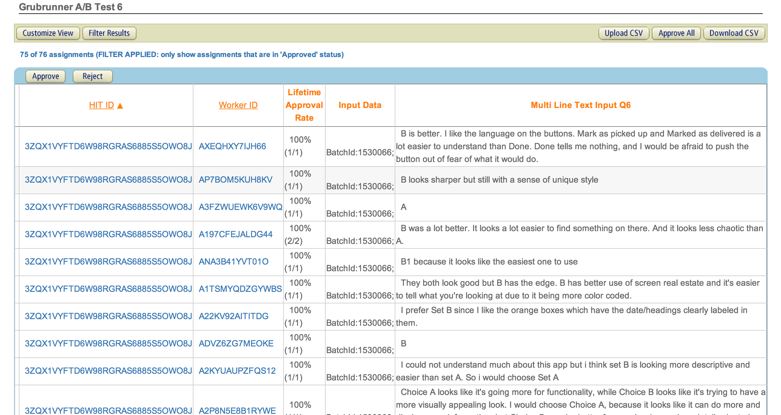
We asked people to read a brief description of the app, compare two sets of four screens each, and then choose the set they thought was best. It took us a few iterations to find the sweet spot between the test description and the amount of money we offered. In the end, we offered $0.15 per respondent for a test described as: “Compare two similar app designs and choose your favorite. Please briefly explain the reasons behind your choice.” We set the assignment duration to 5 minutes (much longer than it would typically take a user to complete, but taking into consideration slow respondents) and ran the test from 11am to 8pm on a Monday. By early afternoon we had nearly 70 responses, and we hit the 75 mark before 6pm. The total cost for the test including MTurk’s fee was $12.
STEP 3 – ORGANIZING THE DATA
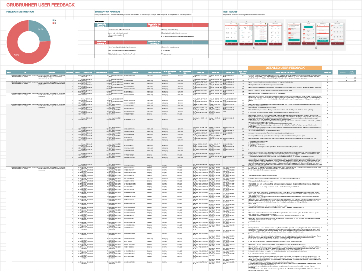
MTurk makes this part pretty easy. You can read through individual responses on the website, or you can download a csv file like we did, which we just imported into a Google Doc to track and quantify our data. If you used radio buttons to indicate A and B selections then these will appear in separate columns, making it easy to grab the sum totals. From there you can produce a simple visualization, like a sweet donut graph, to make it really clear which design is the winner. If you use Usability Hub (or another testing service), they have some pretty good analytics tools set up for you to make sense of the data as well.
We try to organize the information in a way that anyone can gather the main takeaways at a glance, while still being able to go deep into the data if they want to. What works for us is to lead with a visualization, such as a chart or graph, accompanied by some big, bold numbers. We’ll follow this up with a short list of the most common pros and cons for each design mentioned by respondents, as well as the most helpful positive and negative comment for each. Then we’ll include the images of the designs that were the focus of the test, and below this we’ll list all the actual comments along with any important response-specific data, such as response times. The idea is for anyone to be able to look at this document and understand within a few seconds what the test was about, what the results were, and what the main reasons were behind the results.
So what’s it all worth?
In our example, we polished up our spreadsheet, topped it with a delicious donut, and presented it to our client in reference to the two designs in question. Our responses were split 3 to 1, so it was pretty strong support to back our preferred design. After reading through all 75 comments, it was hard for the client to disagree with the evidence, and so we were able to come to a consensus much faster than we would have without the data. Prior to running the test, we had gone back and forth on the subject for over a week, burning precious time. Once the test results helped us all to agree, we were able to move forward and finalized the app design within the week.
In closing…
More important than winning design arguments, however, is the fact that by integrating this process into our workflow we are creating a more user-centered approach that will hopefully bring the final product more closely in line with the things users actually want most. We’re certain that setting up these feedback loops from the beginning and validating our ideas early and often will pay dividends down the road.
We’re still experimenting with further optimizations to this process, so we’ll probably follow up with another post at some point to share a deeper case study and new insights. In the meantime, we hope you’ll share your own user testing stories and best practices, as well as any tips or tricks you’ve discovered for Mechanical Turk, Usability Hub, or any other tools you’ve been using to get feedback on your designs.
To that end, let’s close this up with a bulleted list of tips for working with MTurk. We hope you’ll find at least one thing here that helps you take your user testing to the next level.
Good luck, and happy testing from your friends here at Fake Crow!
TOP TIPS (Please do share your experiences, we’d love to grow this list with your input)
- MTurk will ask for a brief description of your HIT, which is the first thing potential Workers will read. Try to make the test sound fun, interesting, and easy. If your description sounds like something that is complicated, difficult, or time consuming, the average Worker will move on in search of greener pastures.
- Keep it simple. If you have 10+ multiple choice questions, your test will look like an exam and will appear to take a long time, which will result in fewer responses.
- As a default, Amazon requires providers to have a Master level certification, which severely limits the number of eligible respondents. You can change this setting from the “Advanced” section at the bottom right corner of the Edit Properties tab when creating or editing a project. Change “Worker’s Requirements” to Customize Worker Requirements, set your HIT approval rate to 95%, and lower your number of HITs approved to 500+. This way you’ll get much faster results, and spare yourself the additional fee that Amazon charges for using Master Workers.
- If you are A/B testing, have respondents use radio buttons to select A or B. This will provide data that is easier to export than if their answer is embedded in a paragraph of text.
- That said, the best answers come from open ended questions paired with a paragraph text field. Let them go into as much detail as they want, and you’ll be surprised how many people spend time on lengthy explanations.
- When describing your task, give step-by-step bulleted instructions that are clear and easy to follow, so anyone reading it will know exactly what you are asking for without room for interpretation.
- Keep the language light and conversational, with a sense of humor. Try to entertain a little and make it fun, and people will tend to open up a little more. If you sound like you’re conducting a medical trial, people will treat it like one.
- Be sure to thank your respondents, and let them know how important their contributions are to your design work. This will increase the likelihood that they will respond to your HITs in the future.
- Also keep track of Worker ID numbers for respondents who give outstanding feedback. You can solicit them directly on future tests.
- Export your results as a CSV and save a Google Doc to keep track of all your test results. And don’t forget the sweet donut chart!
Related Reads:
Shortening UX to UI Time: A Different Approach To MVP Design


