BLOG
FAKE CROW'S BLOG
An Interactive Style Guide For Greenpeace’s Arctic Campaign
Hoping to unify their campaign messaging and inspire creativity, Greenpeace tasked Fake Crow to create a Style Guide for the Arctic campaign. Our objective was to help Greenpeace build an “open source” movement, where activists and supporters across the globe can find the simple ingredients to create something that will help protect the Arctic.

A Stronger Campaign Message
With a coherent visual aesthetic comes a unified brand identity and focused campaign message. Too many variables across campaign materials divert audiences’ attention away from the brand’s core message.
Global brands and their agencies have strict branding guidelines in place that ensures integrity of the brand identity across campaigns all over the world. Greenpeace team wanted to bring that level of polish to the Save The Arctic campaign, while encouraging diversity and creativity.
A brand’s messaging is strengthened, and performs better when there’s a consistent visual language across all channels. Style guide is a strong tool that helps define this unified language.
Together with the Greenpeace team, we envisioned a Style Guide that respects the urgency, speed, and creativity that goes into spreading the word about the Arctic.
To appeal to both professional and non-designers, our guide embodies simplicity in both style and use. It balances the rules of consistency found in standard style guides with the freedoms for anyone to create personalized content. All while showcasing the beauty of the Arctic.
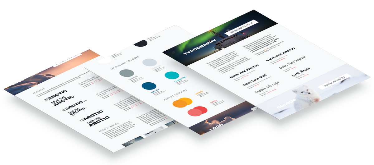
Rather than a style guide that was simply a PDF that circulated internally, we created a publicly accessible web-based guide. We rethought the guide in the traditional sense and conceptualized an interactive style guide that offers an engaging and streamlined experience.

The Process
We brainstormed potential layouts and began wireframing several options right away. With lots of information and assets to organize, our biggest challenge was figuring out how to handle the navigation bar and subsequently organize all of the assets.
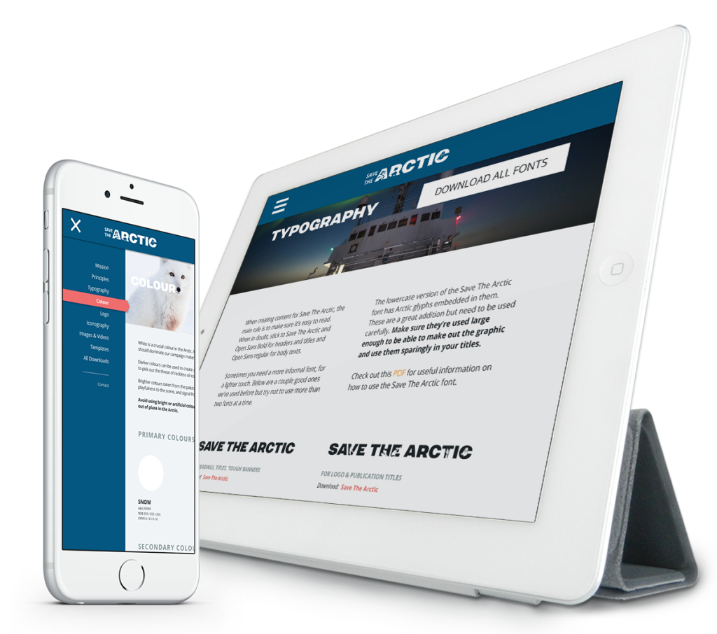
We implemented a responsive page structure to allow viewing on all screen sizes (desktop, tablet, and mobile) and a sticky navigation that makes navigating between the categories easily viewable and accessible.
The Style Guide’s first purpose is to organize all design assets, eliminate the noise and offer focused and consistent visual guidance. Given Save The Arctic’s pre-existing fonts and color palette, we performed typeface and color studies to reveal design elements that complemented and aligned with the overall campaign identity.
Typeface Study
Greenpeace activists have been using a variety of fonts in their design materials and needed to introduce consistency to their efforts. For example, we moved away from Helvetica. Even though it’s a modern and clean typeface, for the purposes of the Arctic campaign, it had a rather corporate feel.
Before we began our typeface research, we determined the key criteria for what we needed.
The typeface must…
– Be readily downloadable and free to use,
– Be multilingual, containing additional characters allowing for use around the world,
– Visually convey “Save The Arctic” mission and principles.
Our finalized typefaces resonate with Save The Arctic’s identity — the typefaces embody the gravitas of the mission, while maintaining the peace of the Arctic habitat and friendliness of the culture.
After finding combinations of typefaces that complement one another, we plugged them into the UI with proper font sizes and various colors. Putting these typefaces in the context of how they would be displayed gives us a better picture of whether or not these fonts suit Greenpeace team’s needs.
Color Study
Greenpeace team provided us with about 11 colors they had already been using. The multitude of shades had resulted in an unfocused color palette. We drew certain colors from this color scheme to lay the foundation of the color palette. In addition, we used Greenpeace-provided images and our own mood board to help guide the direction of this new palette.
The primary colors serve to symbolize snow and oil. Instead of using the harshness of true black, the shade we chose to represent oil allows for more depth.
The shades of blue in the set of secondary colors capture the essence and energy of The Arctic. We intentionally avoided darker and muted shades that could potentially give off a somber aesthetic.
Lastly, the accent colors pop on top of both dark and light shades. Because pink and orange are opposite blue on the color wheel, they were obvious choices for high contrast colors. The accent colors we chose contrast with dark backgrounds and easily function as links or call to action buttons. Like the secondary colors, these accent colors capture a lively energy.
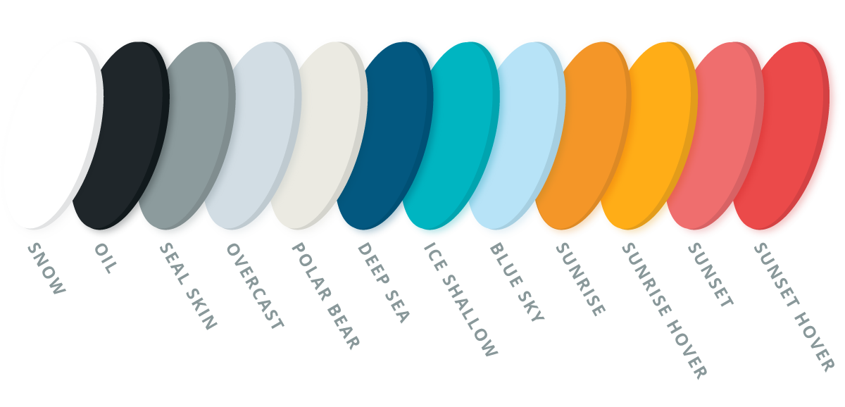
The final step of determining the colors was to place them in the UI. We had to make sure the colors work well with one another, with our typefaces, and could be used as website elements.

Empowering Activists
Besides unifying the branding guidelines, the ultimate goal of the Style Guide is to equip activists around the world with additional tools and resources they can work with.
Iconography
Greenpeace team pointed out 18 ideas icon objects they find essential to represent the campaign message. We were inspired by Save The Arctic’s sister campaign, “Into The Arctic.” The iconography created by this campaign set the tone for our direction. We really liked the circle borders, thick line strokes, horizon line. A big thanks and kudos to the design team behind IntoTheArctic.org. Spinning off their Wildlife icons, we completed our full iconography set.
Videos & Images
Greenpeace has an incredible archive of Arctic images, captured by world renowned photographers. Not many people knew that these resources are available. Greenpeace offers these images and videos for everyone to take and use — for free! Our job was to make it easy for visitors to discover and download visuals from their stunning catalog.


Templates
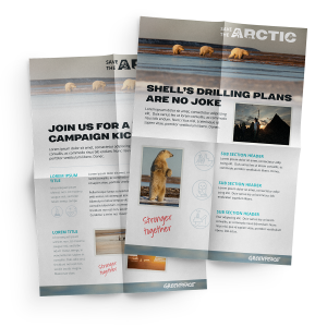
Because Greenpeace’s advocacy efforts are often running against the clock, activists and supporters have little time to design posters and banners. Using the tone already set in place by Greenpeace and Save The Arctic, we created templates for social media banners, cover images, large size posters and flyers ready to print out. These speedy and easy-to-edit templates that activists can alter with their own messaging, and easily use on the go.

Conclusion
Consistency of visual cues, and protection of the branding guidelines, help establish big brands in the minds of consumers. We wanted to apply the same principles here. Our objective for this project wasn’t to simply create a visually appealing guide, but to create a resource that would help reinforce the mission to defend the Arctic, and make it easier for those who believe in the cause to take action. So that everyone across the world, whenever they see a banner, an icon on a t-shirt, a video put together by their local Greenpeace office, just with a glimpse of an eye, they can recognize the cause, and know where to go to take action.
Credits:
Project Lead – Asli Sonceley
Creative Director – Alper Cakir
UX/UI Design and Icon Design – Jen Valentine
The Arctic Needs Your Creativity
And now it’s your turn to be part of the movement. You have the tools at your disposal to enact real change. Learn more about Greenpeace’s design competition (and the brilliant prizes you can win) by visiting the competition page.
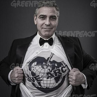
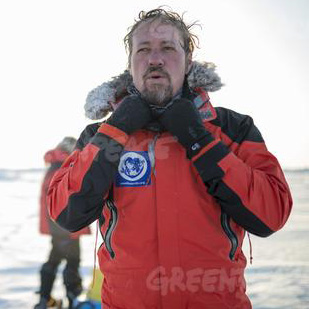
The winning entries will receive a Vivienne Westwood Arctic T-Shirt and one of the actual expedition jackets!
Related Reads:
17 Of Our Favorite Stock Image and UI Design Sources

Designathons Are A Thing
Find High Quality, Free to Use Images for Your Site with Google Search


