BLOG
FAKE CROW'S BLOG
Designathons Are A Thing


How to Give Your Product Design Process a Creative Boost
Here at Fake Crow, we’re always looking at ways to improve our iterative design process. In order to accomplish big things with a small team, we have to leverage all of our resources as efficiently as possible, and this includes creativity.
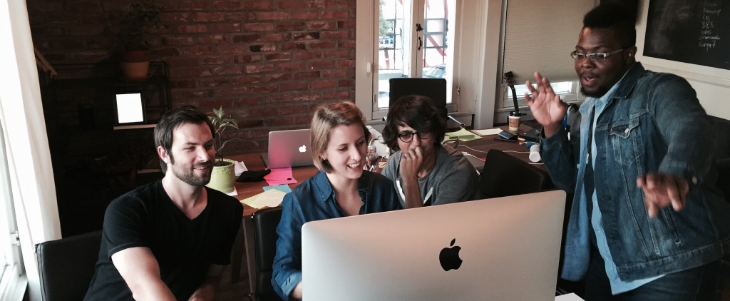
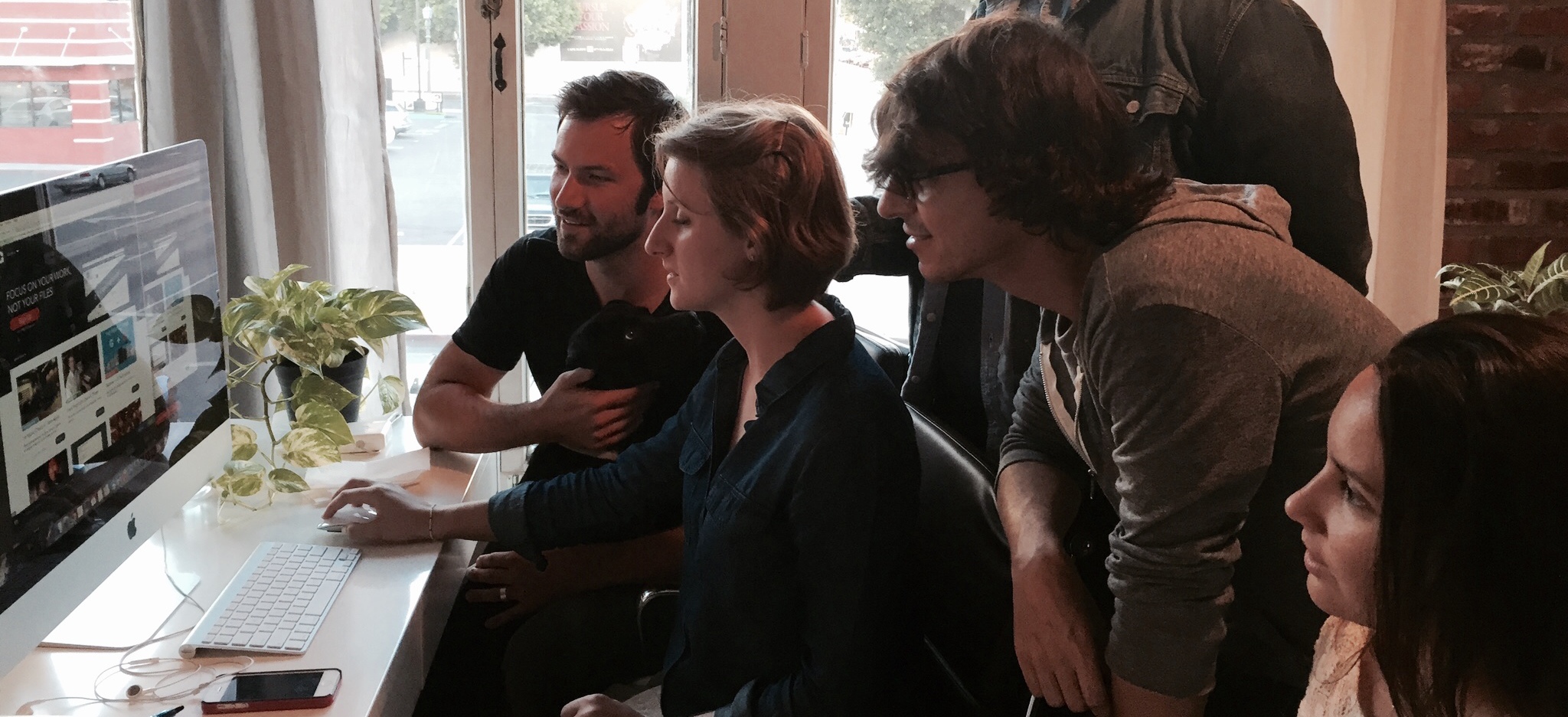
We’ve been running in-house designathons to brainstorm a variety of design ideas in a short amount of time. Although a single designer may take eventual ownership over a project, we start out each time with a period of group collaboration to cover a wider range of possibilities than could be expected from one person working alone.
In case you haven’t heard the term before, a designathon is basically a hackathon for designers. A hackathon is traditionally when a bunch of developers get together and pull a caffeine-fueled all-nighter to collaboratively code and create sleep-deprivation-inspired applications.
These guys from MIT explain hackathons pretty well.
IDEATION – Understanding the Big Idea
We start out with a high level overview of the project so everyone understands the product vision and the context of use. Then we narrow the focus to one essential point of interaction, which could be anything from a product dashboard, a homepage, or any other screen that captures the fundamental functionality of the product. With that screen in mind, we list and discuss any and all design criteria – the critical product features that must be included in each design. This list is usually a combination of preferences and requirements communicated by the client and our own usability insights. We sketch this all out on the whiteboard as a reference point.
RAPID ITERATION – Quick Design Sprints
With this common starting point in place, we set a timeframe for the designathon. We usually set the limit at 4 hours, with a 15 minute break scheduled at the halfway mark. Then everyone splits up, puts in their headphones, and dives into their own creative zone for a two hour sprint. At halftime we break, stretch our legs, empty our bladders, refill our coffees, and refresh our eyes for the next leg. Then we go back in, and we grind away for the next two hours until time is up. At the end of the second sprint, we take another quick break to recover our senses, and then we all gather ‘round for some good old fashioned show-and-tell.
FEEDBACK – Honest Peer Evaluation
Each designer spends 5 minutes or so explaining their concept, the proposed interactions, and the thought process behind it. Then we go around the room and give critical feedback on each interface, with a focus on identifying strengths and weaknesses in key aspects such as usability, information hierarchy, functionality, feasibility, and aesthetics. We all take notes on how to improve our designs, and then we go back over them for 1 more hour to polish them up according to what we learned in the critique round.
RESULTS – Build Consensus Early On
So what’s the point of all this, besides it being a lot of fun? Well, at the end of 6 hours, we’ll have created a half dozen or so high quality design comps covering a broad range of creative possibilities. This means we can come back to a new client within 24-48 hours and show them a selection of potential directions for their product. This helps them visualize the possibilities of what we will be creating together and get excited. Creating buy-in at the early stages of the relationship is so important and this method gives us a ton of things to agree on.
Similar to what we did in-house, we go over each design with them to find out what they like and/or don’t like. This goes a long way towards helping us get to know their priorities and preferences, and informs all future design work with the client. They will usually gravitate towards one aesthetic, but almost always find aspects they like from each design. This gives the final product owner/designer a wealth of information to draw from when they begin building the actual product, and helps avoid the common hit-and-miss that can happen at the beginning of a new project. It probably saves us on average at least two design iterations, and gets us through the feeling-out phase much faster than before, so we can sign off on the basics and get down to the more difficult decisions.
OUTCOME – A Better User Experience for All
Designathons have become a powerful tool for us offering a ton of creative leverage, and we’ve been really happy with the results so far. More importantly, we’ve been able to deliver increased value to our clients, which makes them happy too. Hopefully, all this results in a better finished product, which in the end means happy users. And since user happiness is what we’re all about here at Fake Crow, it looks like designathons are here to stay.
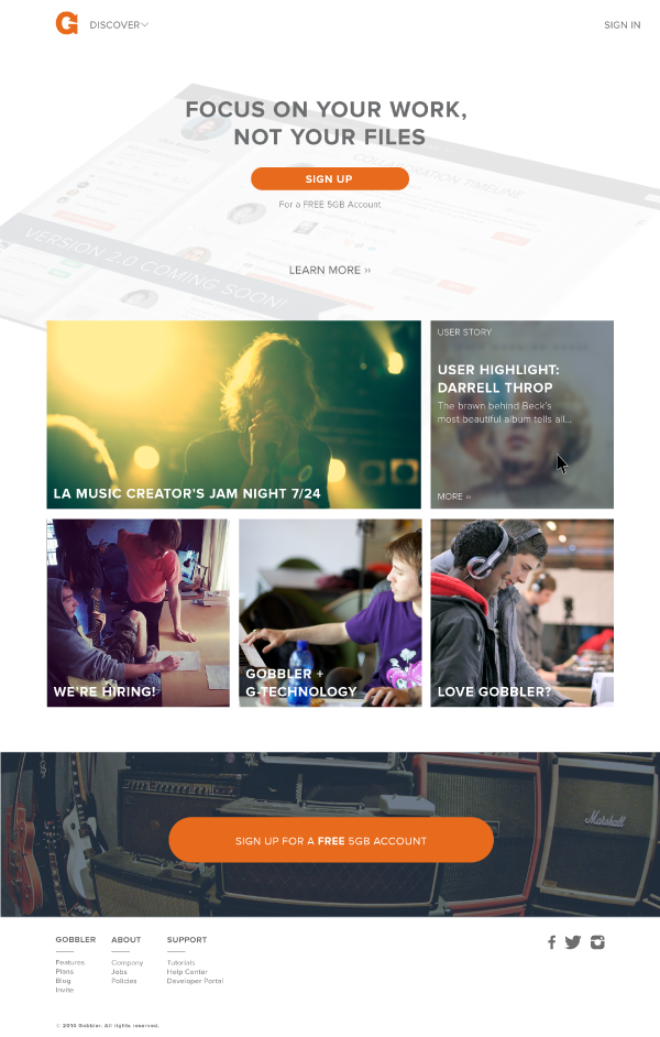
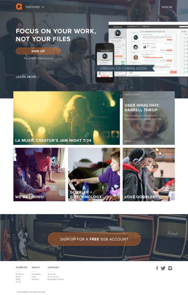
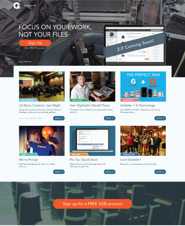
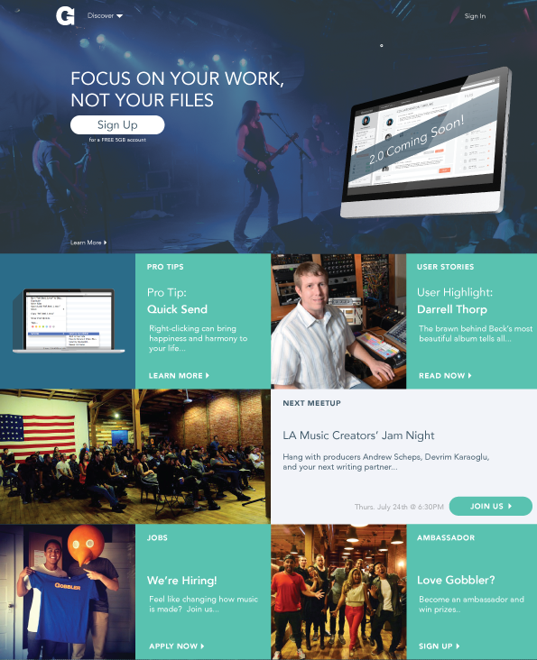
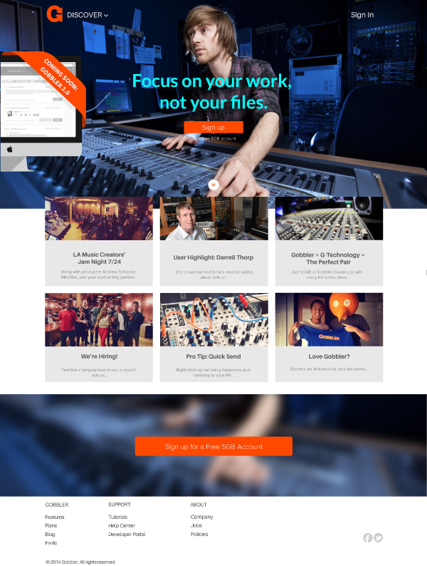
Last but not least, here are some screens from a recent designathon we did for Gobbler’s home page redesign. Be sure to check out the final results at Gobbler.com.
Design team tried a few different looks for above the fold section. Note the different use of images, CTA colors, placement of Beta announcement.
For the content area, we tried a couple of different layouts. Among them was a metro UI style grid. The thumbnail view below (to the left) made it to the final pass.
At the end of the sprint, we had a good chunk of options to consider for essentially the same page, same content, based on the same wireframes, but visualized differently.

If you are interested, you can see the full-on results of this designathon here.
This post is penned by Fake Crow’s own, Mr. Nathan Canning.
Fake Crow is a tech startup friendly UX/UI design agency.
Based in Los Angeles, we designed for 36 startups in 18 cities.
Related Reads:
Rapid User Testing with Mechanical Turk
UX Sketching Kit for iOS Apps
Shortening UX to UI Time: A Different Approach To MVP Design


