BLOG
FAKE CROW'S BLOG
We helped Kuna boost their sales by 265% : A Case Study


The Challenge
Kuna came to us for a website redesign and optimization project to help increase sales and revenue. Considered “the first home break-in prevention solution,” Kuna wanted to find a way to optimize their website to reduce the bounce rate and boost conversions with a newly designed web experience. After exceeding their Indiegogo funding goals by over 400% and having new publications written up left and right, it was clear that the buzz and traffic was there. To meet the demand, they needed a smooth and streamlined e-commerce experience.
They came to us for a website redesign project.
We told them, “let’s not.”
The Process
We quickly assessed that instead of a full redesign, we could perform quick experiments utilizing the existing site content. This would helps us guide our design decisions for a larger overhaul. The key performance indicators (KPIs) were clear: home page bounce rates, purchase conversions, and total sales. With this in mind, we defined early assumptions for elements to improve upon and variables to test.
Early Assessment
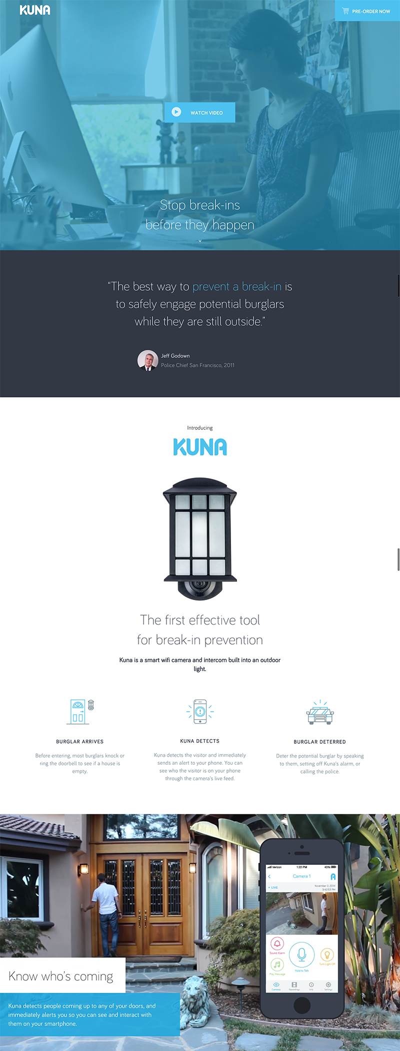
- It is unclear what is the visitors’ primary “call-to-action.” Both buttons do not have enough contrast with the background to grab the visitors’ attention.
- The video in the background does not clearly indicate what the product is and what its function is.
- The tagline visible “above-the-fold” does little to convey the product’s description or the company’s value proposition.
Assumptions
- Adding a clear navigation bar with a contrasting button that says “BUY NOW” will encourage visitors to click through and result in higher conversions.
- Moving the video looped section with the man at the door and video recording on the app will better convey Kuna’s offerings above-the-fold and will decrease bounce rates.
- Defining Kuna’s above-the-fold tagline to better describe the product will decrease bounce rate.
A speedy survey
Before we could get started with testing an alternative design and page structure, we needed to understand who our customers were and what motivated them to purchase a Kuna.
We designed a 6-question survey to be sent to existing Kuna customers. We received a total of 118 responses. The key finding was that the primary motivators for purchase were based on customers’ concerns for safety and surveillance while they were away from home. The second key finding from the survey results found that customers that own a Kuna describe it to be “an outdoor light fixture with a camera.” This finding, in turn, helped us refine Kuna’s product description, which we brought up to the main banner.
Testing our initial assumptions
Now armed with design assumptions and a new direction for Kuna’s product description, we were ready to quickly test our assumptions with an A/B test. We structured an alternative view of the home page with minimal design changes to test our assumptions.
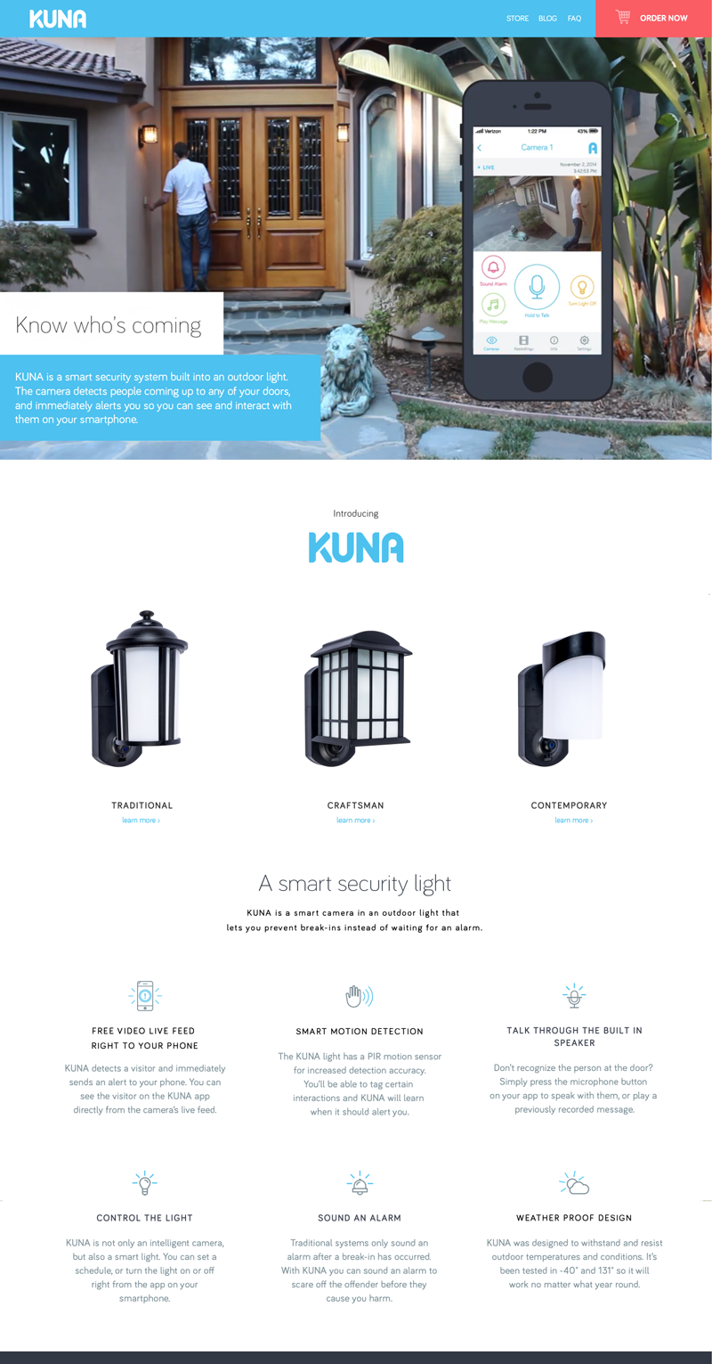
Test Version
- Added a navigation bar with bright, red “BUY NOW” button.
- Shuffled the sections around to bring up the video loop of the man at the door above-the-fold, and brought up the different product shots and features higher in the page.
- Added a sentence to the main paragraph to say “KUNA is a smart security system built into an outdoor light.”
Using Google Analytics’ built-in Experiments functionality, we set up the original home page design (Version A, the Control) and our test design (Version B, the test) to each fire randomly and evenly and at all visitors coming to the home page. This will allow us to quantitatively see which design will perform better.
The results after 3 weeks: an 89% boost in sales
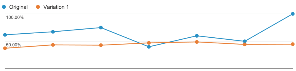
Within the first eight days of the experiment, the results were clear. The test design already had a 15% decrease in bounce rate compared to the control version. By the end of the three week test, the bounce rate had improved by 31%, conversion rates increased by 66%, and sales increased by 89%.
The results from this A/B test confirmed our assumptions. When it comes to above-the-fold content, the language needs to bring clarity to the product’s description and the visuals need to tell a story that conveys the product’s value.
“If we went after a big design overhaul, we wouldn’t have seen the speedy results we got in the first 3 weeks of our efforts. This would have cost us lots of time in decision making and missed opportunity in revenue.”
Solving additional design challenges
With these key findings, we were ready to do a complete redesign of the home page. But we realized that we still had some problems to solve. Not only did visitors need to quickly understand what Kuna was, they also needed to grasp its features and benefits as well as what else was offered in the product line (including a subscription model for video recordings). With this in mind, we had some new assumptions to test.
New Assumptions
- Developing a tagline that not only describes the product, but also conveys a key benefit will better connect with prospective customers and speak to their needs. This in turn will likely decrease bounce rates.
- Forefronting a large image of the physical product will bring more clarity to the product line than the video alone. Again, this will likely decrease bounce rates.
- Adding stronger “BUY NOW” buttons for each product will help draw the visitors’ attention to click through and increase conversions.
- Adding lifestyle imagery to support the content will help tell a clearer and more compelling story that resonates with the target audience. This will likely decrease bounce rates.
- Lastly, introducing testimonials from real users (again with imagery to support), will help Kuna make a stronger case and convey validation and trust to prospective clients. This ease of mind will encourage higher conversions and sales.
From the first test, we knew that the assumptions we tested and the variables we changed helped increase performance of both the bounce rates and the conversions. With these guiding principles and our new set of our assumptions, we designed a whole new version of the home page to test against the winning design of the previous test.
The Next Iteration
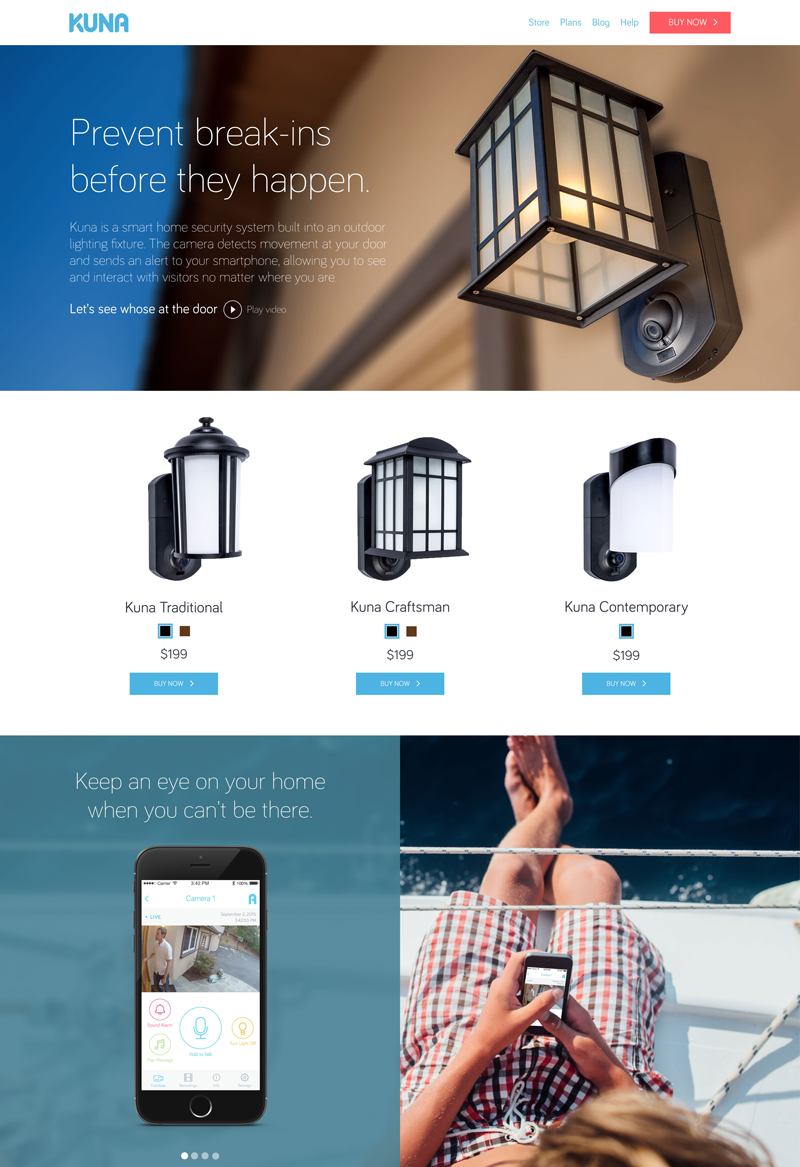
- From the survey, we knew that prospective clients were primarily concerned with safety and surveillance of their home when they weren’t there. We came up with the new tagline “Prevent break-ins before they happen” to address this concern.
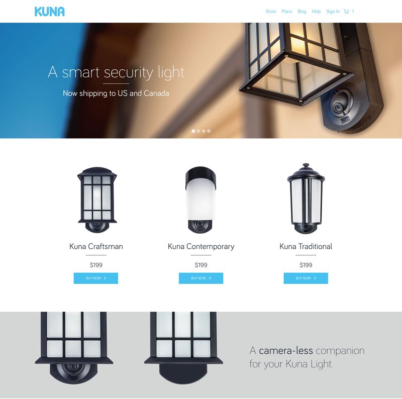
- The main banner image now featured a large shot of the product itself, focusing on the camera. In addition, the banner itself was shorter to show the next section above the fold.
- Each link below the three products now are placed in bright blue “BUY NOW” buttons.
- Each screen of the slideshow exhibited a unique benefit or feature of Kuna with an image that supported the message.
- A testimonial slider was added near the bottom of the home page that featured photos of real customers, a short testimonial, and a shot of their Kuna in front of their home.
Refining the online store experience
Before jumping into another A/B test with our new homepage design, we had to round out the rest of the shopping experience within Shopify. While the homepage needs to intrigue visitors and tell a compelling story, the checkout process needs to be easy to navigate and hiccup-free.
“Every single edit can create an avalanche of subsequent iterations in the code. The changes we made weren’t simply on design assumptions or aesthetic choices — they had to be technically achievable and efficiently implemented across the board.”
We considered these factors:
- Upon landing into the store, prospective customers had to clearly understand the product line without being confused by too many options.
- The pricing of products and purchase options had to be clean and easy to find without distraction.
- The individual store pages had to have a consistent look, functionality and navigation in-line with the homepage design.
We knew that since visitors to these pages were one step further into the purchase funnel, intent to purchase was already there. We weren’t trying to reinvent the wheel. The design of checkout pages need to be simple and convey trust.
We were finally ready to push these new Shopify pages, get the final homepage experiment started, and make a decision based on the results.
A/B Test Round 2: Would it work better?
The Control (A) The Test (B)
The winner of the first A/B Test The redesign with new assumptions
The Results
After four months, the newly designed homepage and simplified shopping experience helped increase Kuna’s monthly revenue by 265%.
Cleaning up the home page to address the concerns of prospective customers and optimizing the Shopify experience were monumental in causing this boost. In addition, we optimized the pages further for faster load times and reliable access. This was also critical to achieve a good conversion rate.
We tested and confirmed two vital points to remember:
- When it comes to the homepage, the language needs to bring clarity and value to the product’s description while the visuals need to support the message. Both need to address a customer’s need or pain point.
- While the homepage needs to intrigue visitors and tell a compelling story, the online store experience needs to be easy to navigate and hiccup-free. Shopping pages need to be simple and convey trust.
It’s important to note that the technical components of an optimization project can become a huge challenge. Every single edit can create an avalanche of subsequent iterations in the code. While running experiments with Kuna, we had to make choices to keep things consistent across the home page, inner pages, and shopping pages. The changes we made weren’t simply on design assumptions or aesthetic choices — they had to be technically achievable and efficiently implemented across the board. A huge part of the job is to streamline these experiments between the product, marketing, design and development teams.
The power of incremental changes
The key to our approach was not going after a huge design overhaul, and trying to make a big statement with visual appeal. All of the variables would have remained moving targets to be measured. Most importantly, this would have cost us lots of time in decision making and missed opportunity in revenue. We wouldn’t have been able to record the speedy results we saw in the first 3 weeks of our efforts. With sales up by 89% in our pocket, we were in a more comfortable place to keep making incremental changes. At each new iteration we established a new baseline with better conversion numbers.
Because we tested our assumptions and made calculated tweaks, we were able to quantitatively measure changes in performance. The experiments helped all stakeholders make quicker and firmer decisions — it’s hard to argue with numbers.
“FakeCrow exceeded all our expectations. They partnered with us when we needed help to substantially improve our website and online store to support a fast growing demand right after our successful crowdfunding campaign. They were creative, organized, accountable and results oriented. We would work with them again in a heart beat.”

Amauri Campos,
VP of Marketing Kuna Systems Corp
In sum, the best way to optimize performance of your product’s website is to constantly run experiments, gather user feedback, analyze results, and fine-tune based on your findings. From testing our assumptions and iterating on the results, we set the tone for an approach where Kuna can continually make incremental improvements. Because after all, small iterations can yield huge results.
Interested in optimizing your website to increase conversions?
or email: [email protected]


